Turning ‘Make It Look Good’ into Code
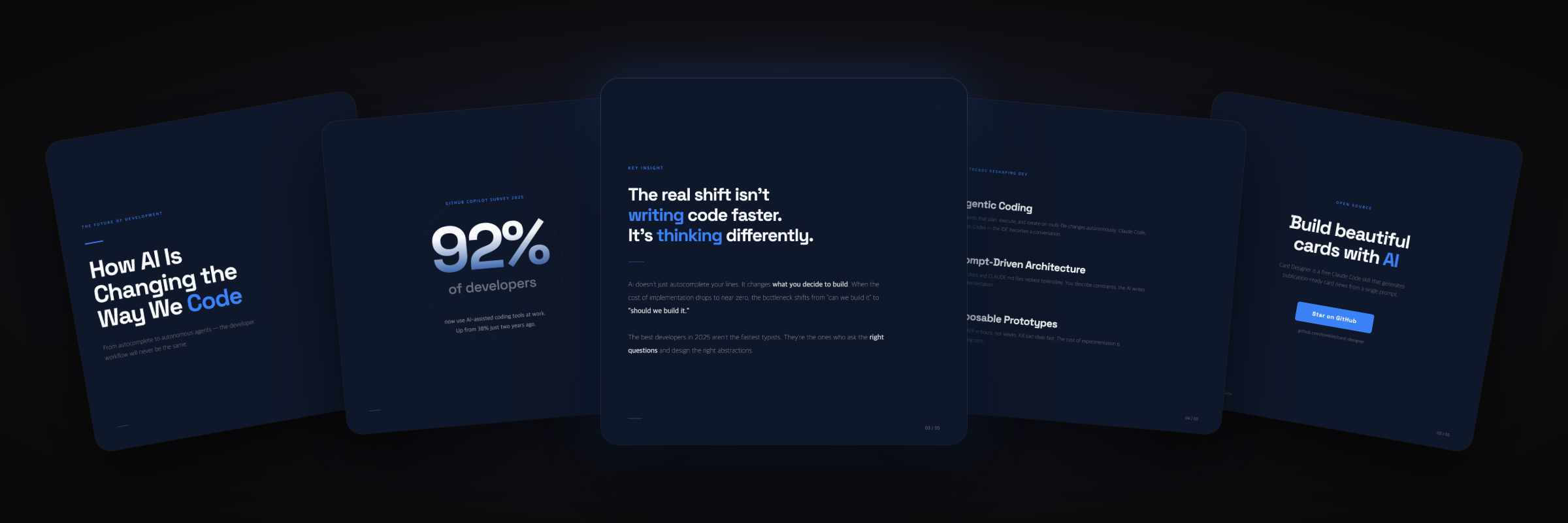
Making Instagram carousel posts by hand for a service I operated had become tedious. I wanted to automate it with AI.
I'm fairly optimistic about Claude's capabilities, so I started casually one weekend, thinking this would be quick. It ended up taking weeks.
The process made me reconsider what it actually means to delegate work to AI. Here's that story.
Carousel posts are harder than they look
Before trying, I thought I just needed to generate a few images. I was wrong.
A carousel isn't usually one image. It's a cover, several content slides, and a final call to action. They all need to look like the same brand. Slightly different accent colors or a logo shifting by three pixels are enough for viewers to notice and conclude that it was thrown together.
The real goal wasn't one pretty image. It was a coherent series. I realized that much later.
First attempt: generate the entire image
I started simply: prompt an image model and receive a finished PNG. In 2026, I assumed this should work.
Maybe because I had little image-generation experience, the designs fell far short of what I'd expected.
More specifically, the text broke. Carousels depend on typography, but copy came back as mangled characters. Korean was worse: a call to apply turned into something barely resembling the intended word. Short words sometimes survived; sentences didn't.
I first blamed my prompt and tried rewriting it, without success. Later, I found this was a limitation of the model architecture.
Readable lettering is a known challenge for diffusion-based image models. Their text encoders learn meaning rather than precise strokes, so accuracy declines as text gets longer. Research has reported reliability problems beyond roughly 20 characters (Visual Text Processing review, arXiv 2025). Korean's compositional characters make the problem harder.
I'd asked a tool that struggled to draw text to do a task made almost entirely of text. A hundred prompt revisions wouldn't fix that.
Change of direction: a document, not a picture
So I changed the framing.
Treat a carousel as a picture, and image generation makes sense. Break it apart, though, and it's closer to a well-laid-out document: headings, body copy, highlight boxes, logos, and backgrounds. Browsers render those precisely every day.
Instead of asking AI to draw, I asked it to write HTML/CSS and rendered that into PNGs with a headless browser. Puppeteer captured each .slide at double resolution, producing 2160×2160 retina images.
There's a crucial difference. Image generation is probabilistic: the same prompt produces different results. HTML rendering is deterministic in the same rendering environment. Fonts draw the letters, so they don't dissolve; #F05A2A produces that brand color; the original SVG supplies the logo.
The broken-text problem disappeared.
But it still didn't look good
The first series built and rendered cleanly into seven PNGs. I opened them excitedly.
All seven looked the same. Dark background, text on the left; next slide, same thing. The right side stayed empty. Swiping barely revealed a change. It looked more like dark-themed terminal output than an Instagram carousel.
This was harder than broken text. Switching tools solved the text issue, but this didn't seem like a tooling problem.
I started writing rules: minimum font sizes, bold emphasis, percentage-based margins, and varied layouts. I put whole paragraphs of design principles into the prompt.
It was still boring. ‘Make it look good’ wouldn't translate into code. More detailed rules just made AI satisfy those rules, not create a good design. I lost days here, but those days taught me the most valuable lesson in the project.
AI knew design. It didn't know our brand
The cards weren't dull because the model was stupid. Modern models, including Opus, can distinguish good cards from bad ones. What was missing was context for what ‘good’ meant for our brand. That lived only in my head.
That's a familiar observation now: context, not the model, is the bottleneck. Where I really got stuck came next.
I didn't know that context myself until I tried to provide it.
In theory, I just had to document my judgment. In practice, writing ‘our brand's design rules’ stalled me. Orange, dark background: easy. But how should emphasis work? I knew it when I saw it, yet couldn't explain it in advance.
It surfaced after I saw a dull card: ‘Of course—white text in a black box. Orange emphasis fights the background.’ The rule had been inside me, but I hadn't known it existed until I saw a bad result. The necessary context wasn't a prepared checklist. It emerged piece by piece when something looked wrong.
Making ‘good-looking’ persistent
I rebuilt onboarding around reacting to outputs: generate cards → identify what feels wrong → record those reactions as rules. Files accumulated in a folder for each brand.
At the center is idioms.json, a machine-readable description of how this brand handles emphasis, lists, and large numbers. An actual emphasis rule looks like this.
"emphasis": {
  "type": "inline-highlight",
  "css": ".emph { background:#000; color:#fff; padding:4px 14px; font-weight:800; }",
  "rationale": "Black box with white text; echoes the lion logo's black eyes and nose.",
  "enforcement": "default",
  "usageBudget": { "perSlide": 1, "perSeries": 3 },
  "contextFit": "Only on slides highlighting 1-2 keywords. Omit when a large number is the focal point."
}
The rationale matters. It records not only ‘black box’ but why: it echoes the logo's eyes and nose. That helps AI adapt the rule to a new slide rather than mechanically copying it.
Then come usageBudget and contextFit. These actually addressed the seven-identical-slides problem. Given only a rule, AI applies it everywhere. Praise a folder-card container and all seven slides become folder cards—wallpaper. So each idiom also gets budgets and conditions: at most three uses per series, only for categorical content such as teams, not a single quotation. The rule and restraint come together.
One detail is revealing. Of eight idioms, the one for success and celebration was deliberately left null. The log said success-feel: TBD, decide in the first real series. I knew we'd need it someday, but couldn't decide how it should look before there was something to celebrate. Context filled in when it became necessary.
With those accumulated rules, a regenerated detail slide used a white-tabbed orange folder card, black labels separating items, and a signature clip in the upper-right corner.
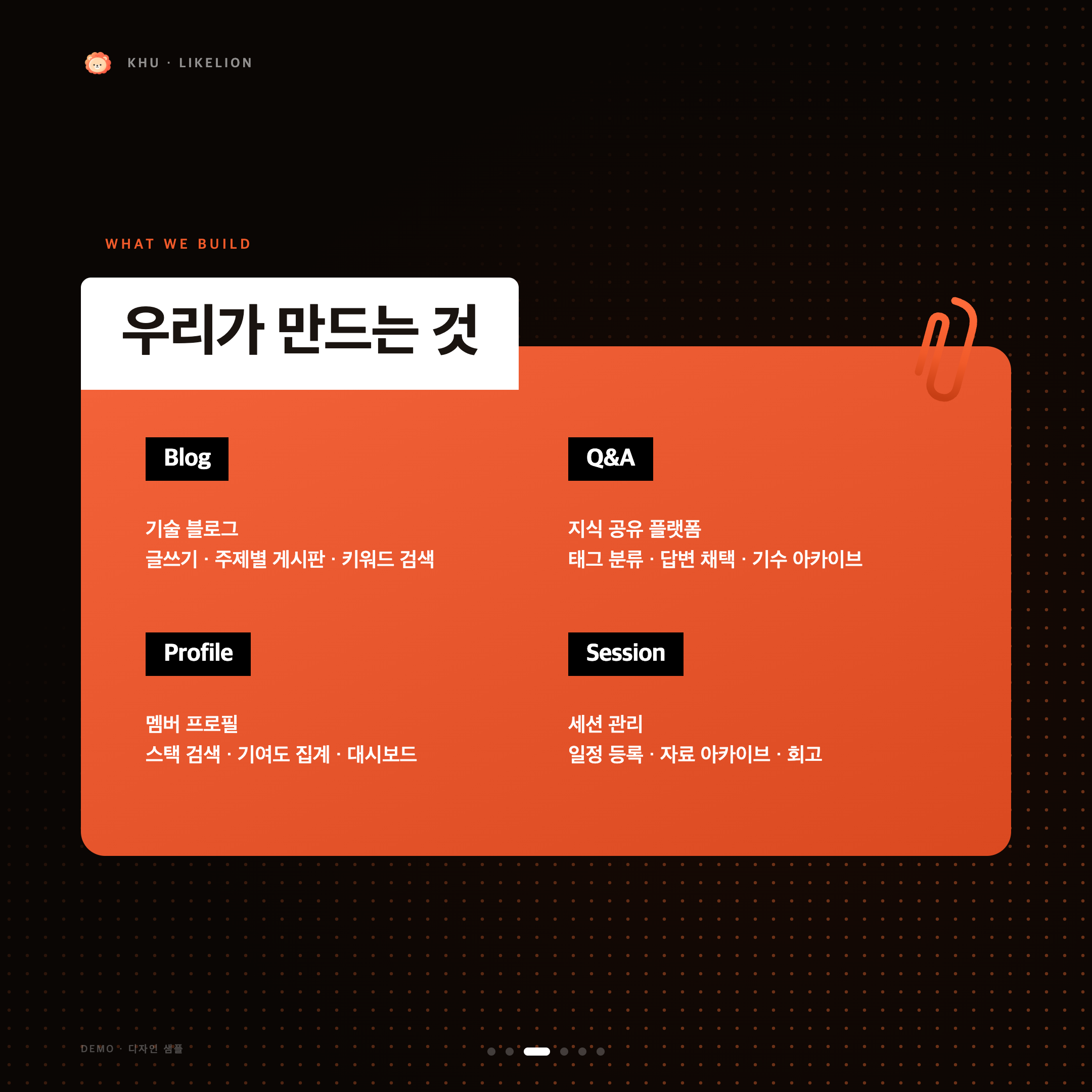
It started from the same ‘left text, empty right side.’ This time, a signature object filled the space, and black highlight boxes echoed the logo. The improvement wasn't a cleverer prompt so much as having files to refer to.
Accumulation, not just generation
These files grow with each conversation. Values in taste-profile.json carry confidence scores. Colors and spacing start around 0.6–0.7 and rise to 0.9 after several series. ‘Accumulation’ is literal here. Repeated feedback such as ‘more space’ or ‘this color works’ promotes a preference into an automatic rule; two contradictory responses demote it again.
By the tenth carousel, the first can look almost unrecognizable. The model hasn't necessarily improved; its context has grown. Those files live in the user's folder, not inside the tool. Colors and fonts can be copied from a screenshot in five minutes. An idioms.json built through dozens of feedback cycles can't be copied that way.
What I haven't solved
There's still plenty to fix. With low-confidence preferences, AI applies rules in odd ways. Tight budgets and context conditions make everything identical; loosen them too far and we're back to wallpaper. I'm still finding the balance by feel.
Half my work in delegating to AI was extracting judgment I had but couldn't yet articulate, using failed outputs to draw it out and solidify it into files. I later learned there's a name for knowing more than we can say: tacit knowledge.
I think the model is often capable enough already. The bottleneck is frequently what's still inside the person's head.
The full code is at github.com/xhae123/card-designer.